

Climate and Energy Strategy
Visual Identity for an important strategy with a swift turnaround
01 PROJECT OVERVIEW
The Lapland Regional Council and Lapland Centre for Economic Development, Transport and the Environment direly needed a visual identity for a timely strategy they were working on.
Category/Industry: Rural areas and the environment
Services: Brand & Identity, Marketing communications
Year: 2024
02 Challenge
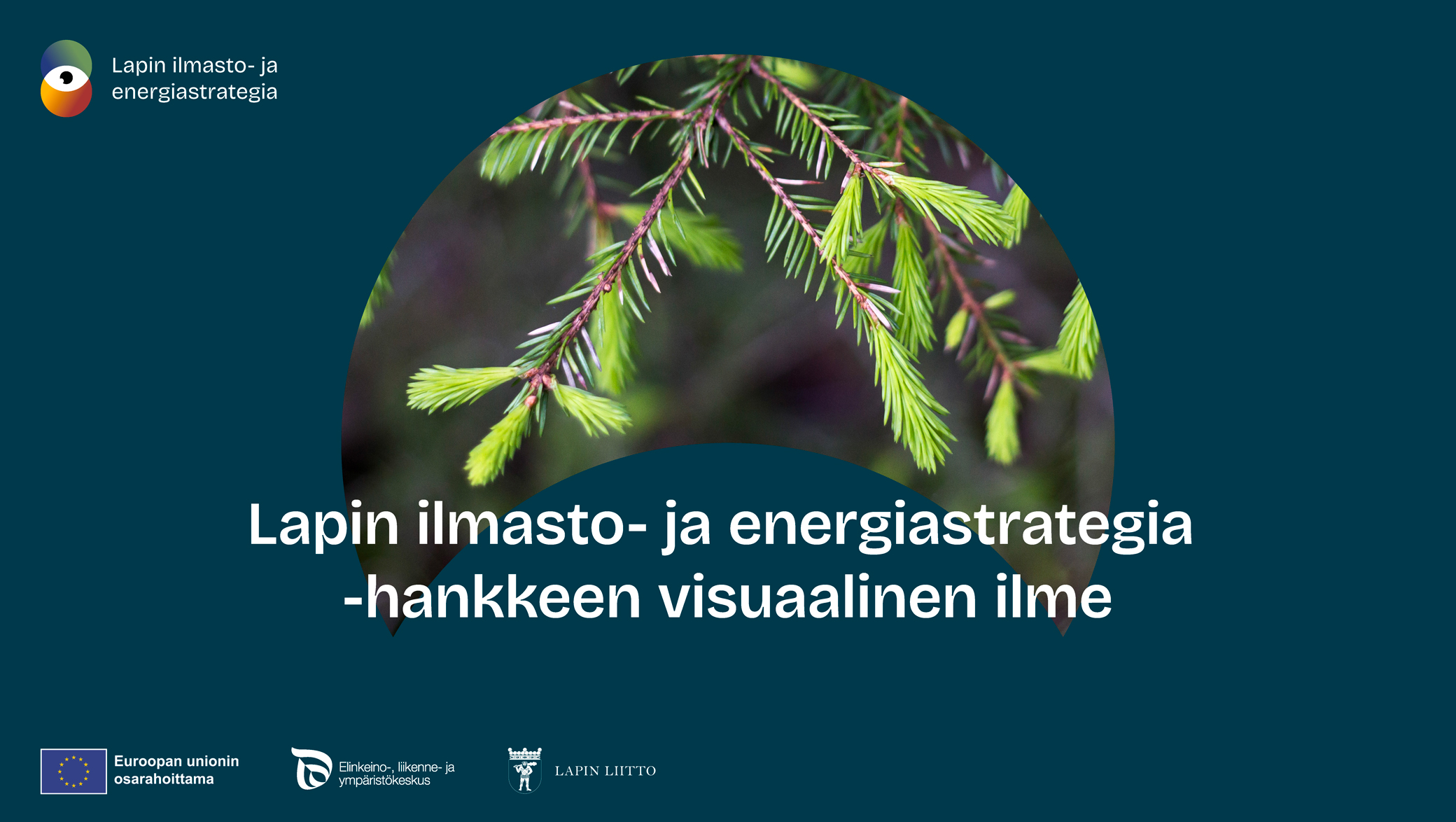
| The challenge was finding a visual expression that conveys a sense of environmental exploration and observation. We also needed to draw attention to the topics at hand in a way that wouldn’t distract readers from the text. |
03 STRATEGY
| We relied on our years of experience to produce a professional yet appealing look in quick order. |
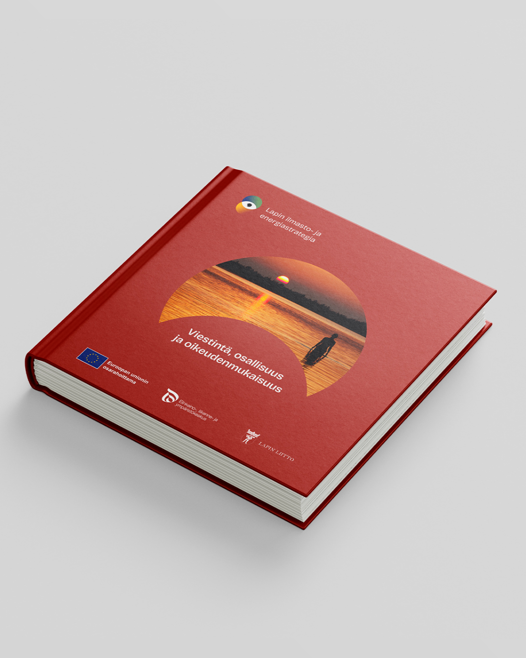
04 Creative solution
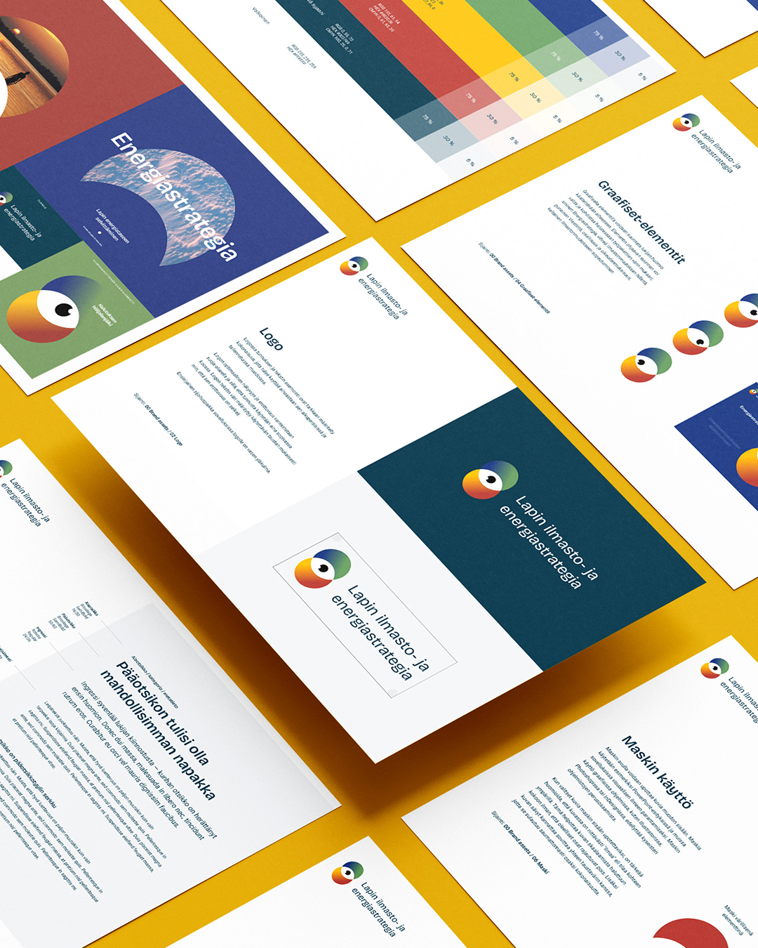
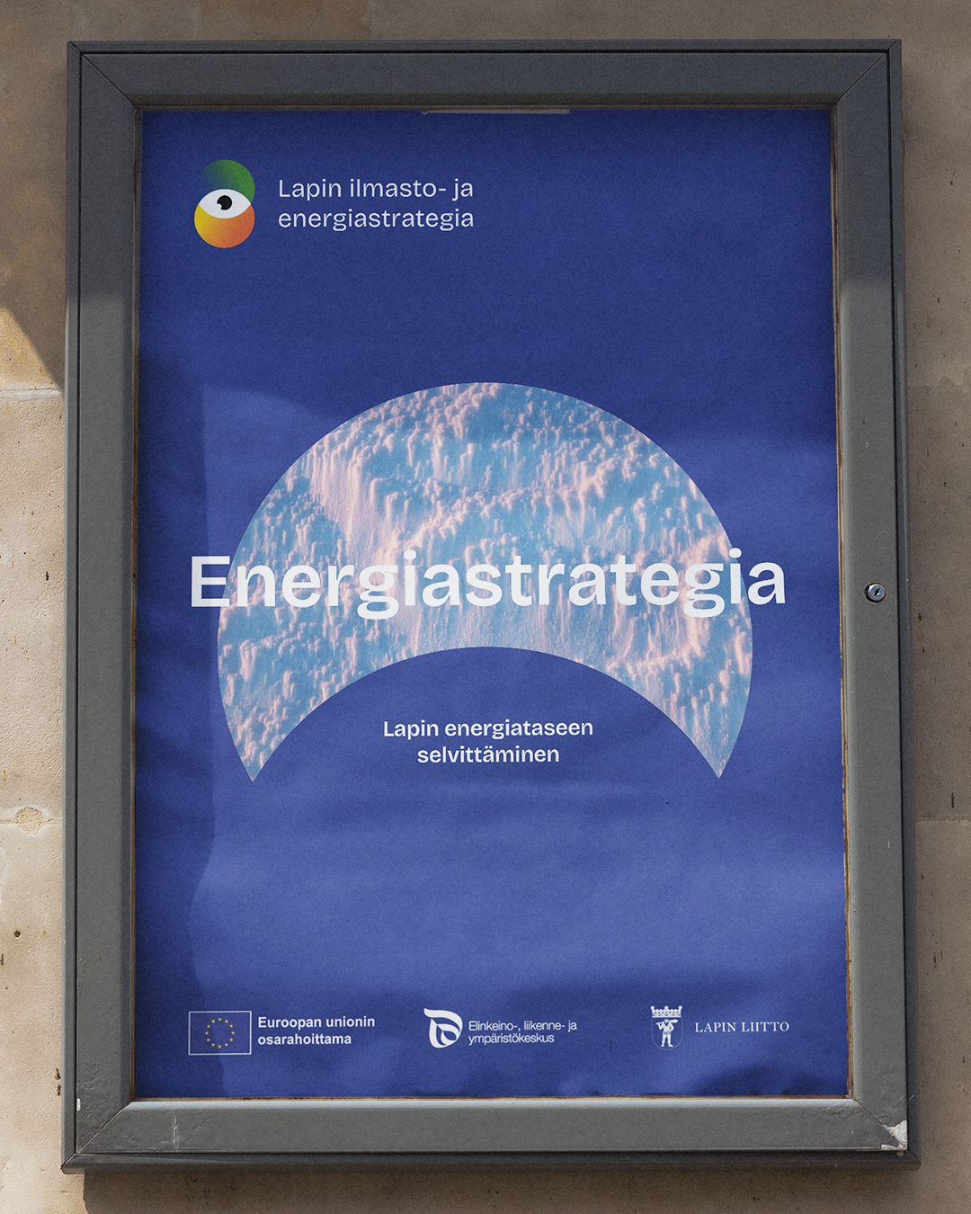
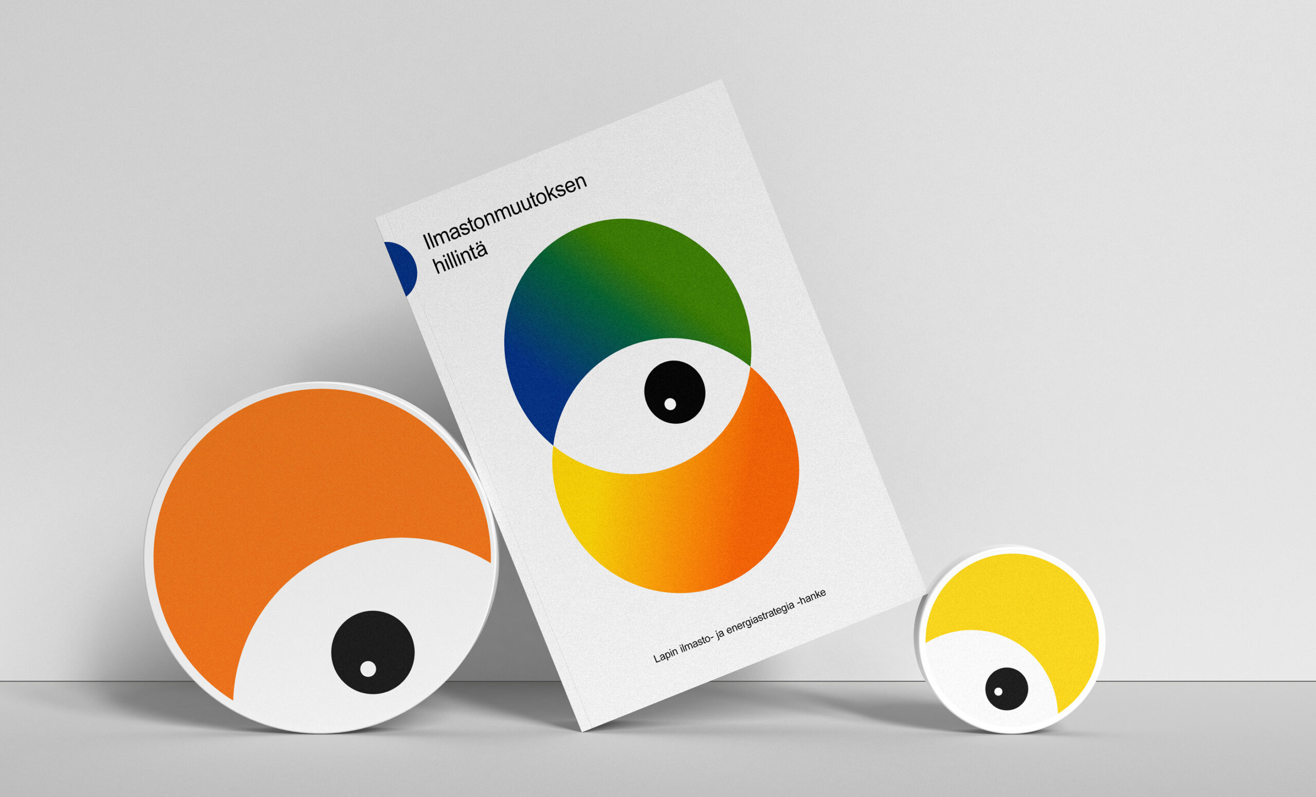
| We created an appealing logo, calm color palette, distinctive typography, supporting styles, and visual guidelines for illustration. |
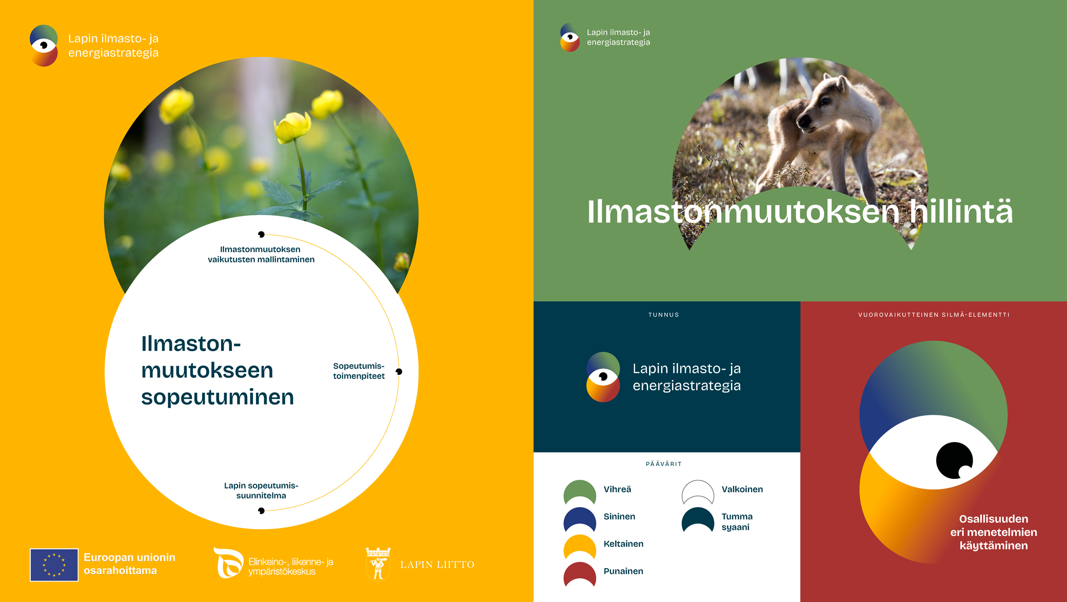
05 IMPLEMENTATION
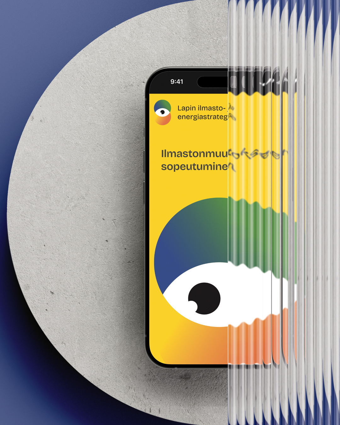
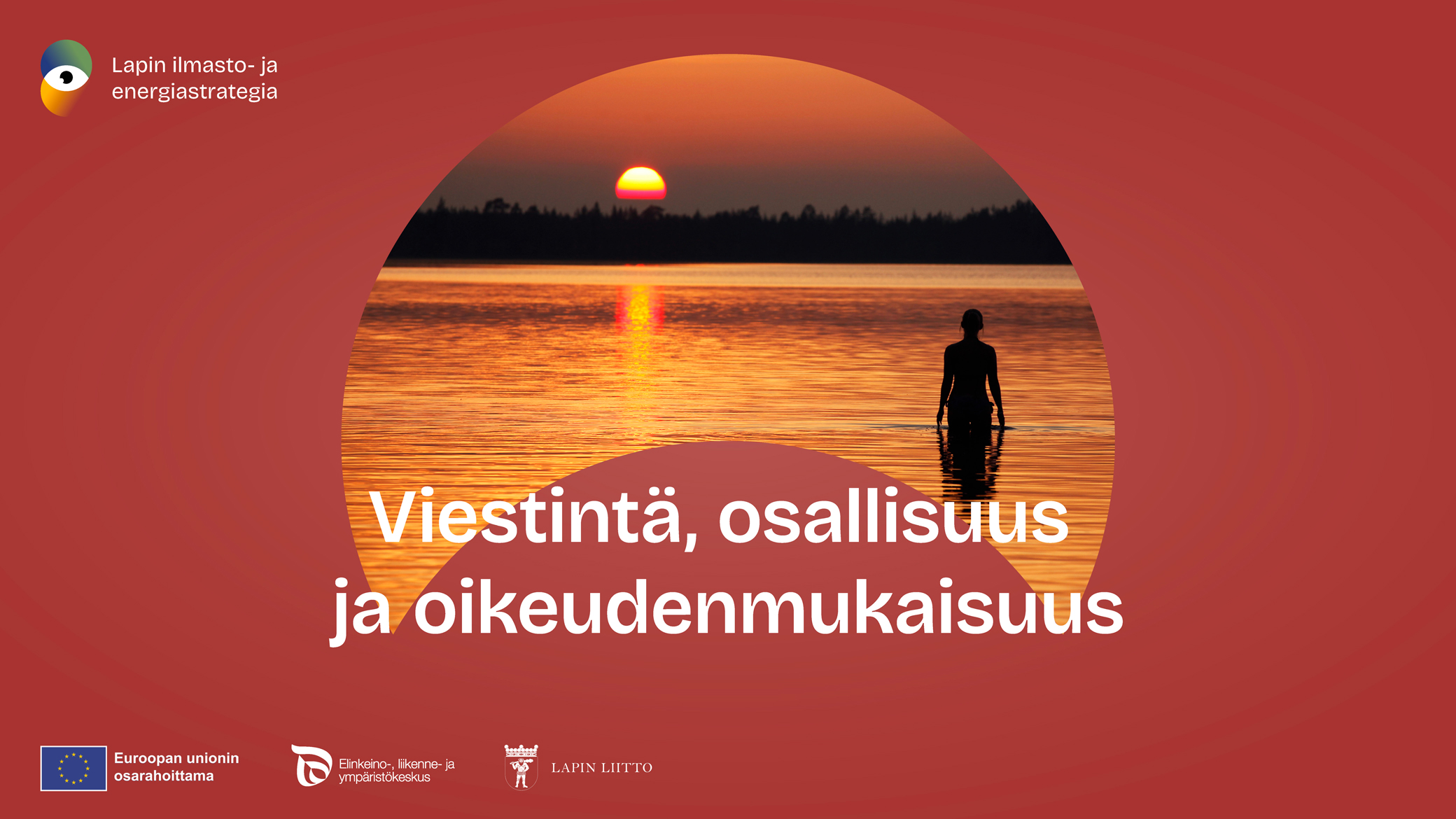
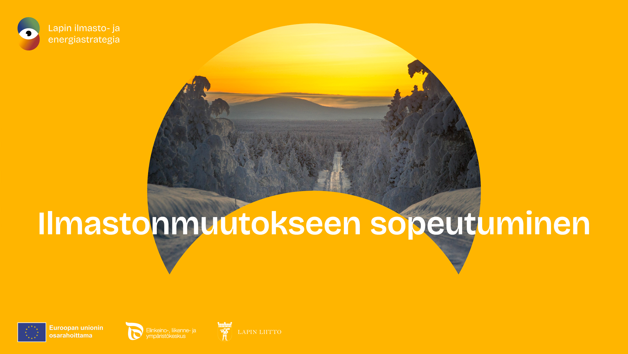
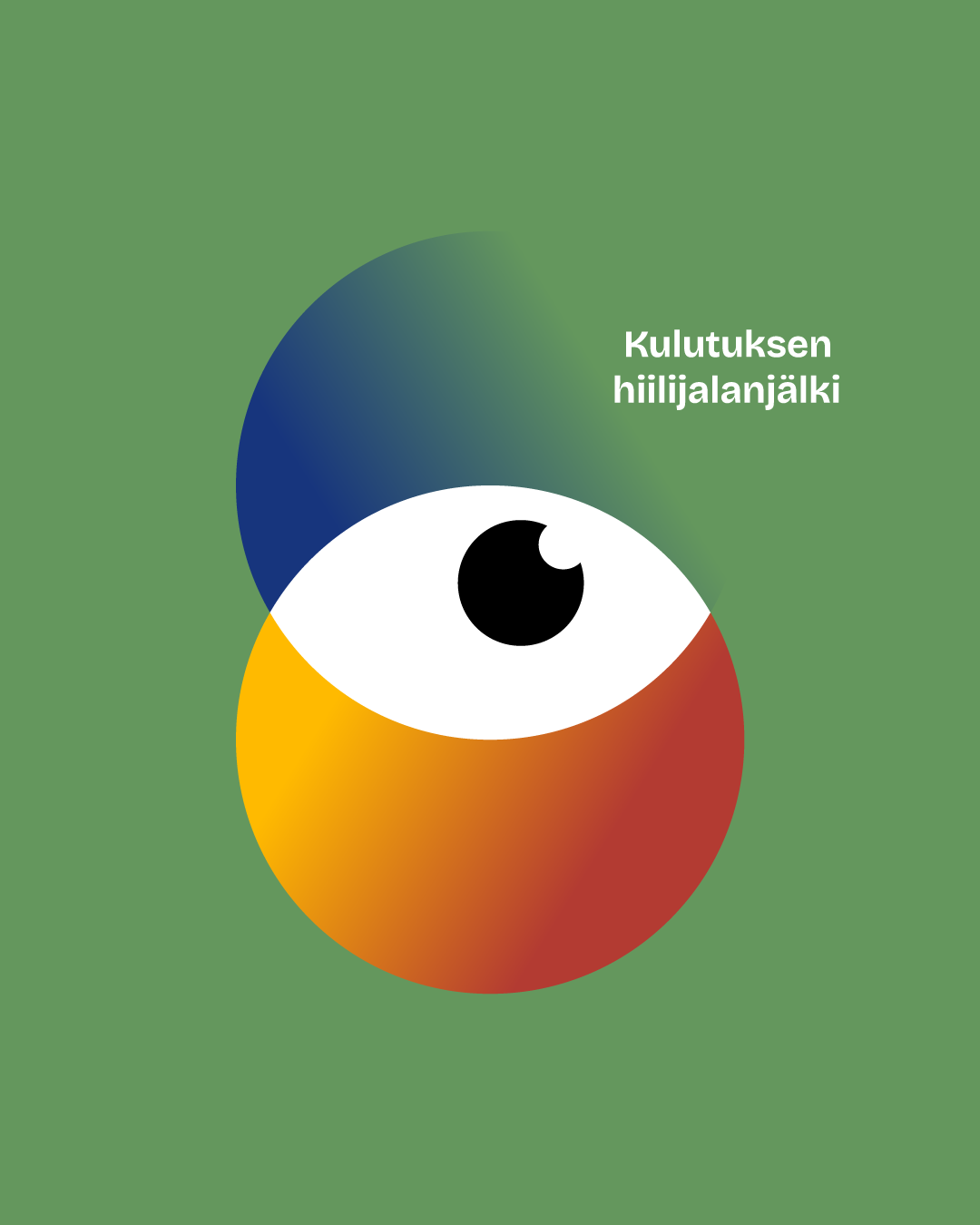
The Eye element can be used to direct the reader’s attention according to the topic. Its color can be aligned according to the work packages: blue for Energy Strategy, green for Climate Change Mitigation, red for Communication, Participation and Justice, and yellow for Climate Change Adaptation.
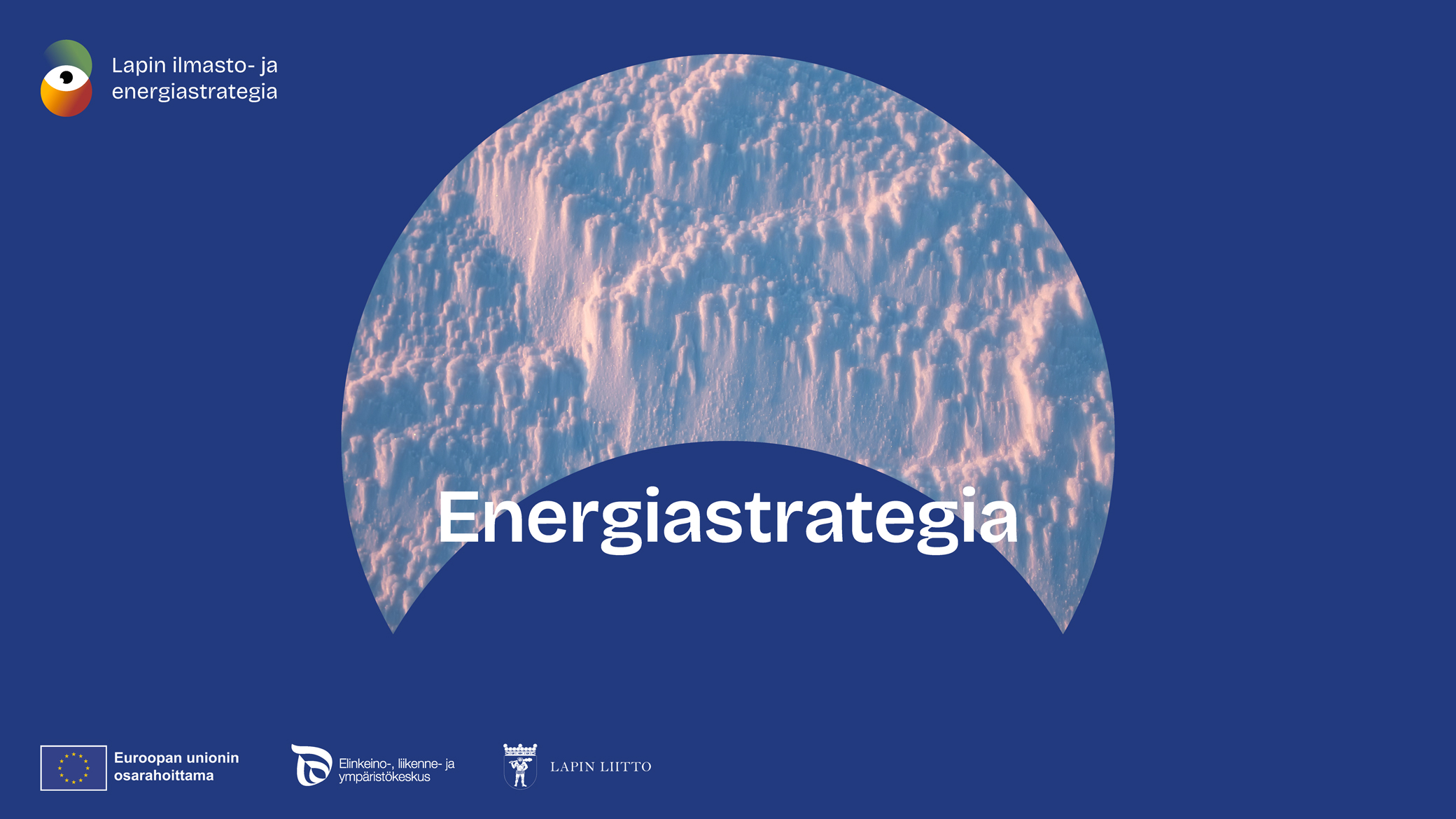
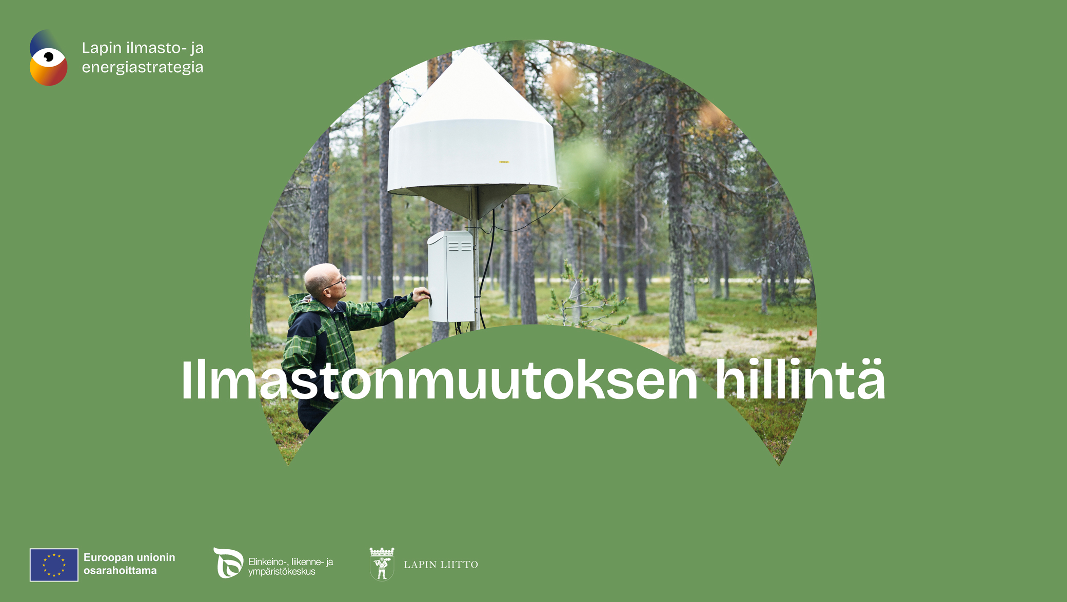
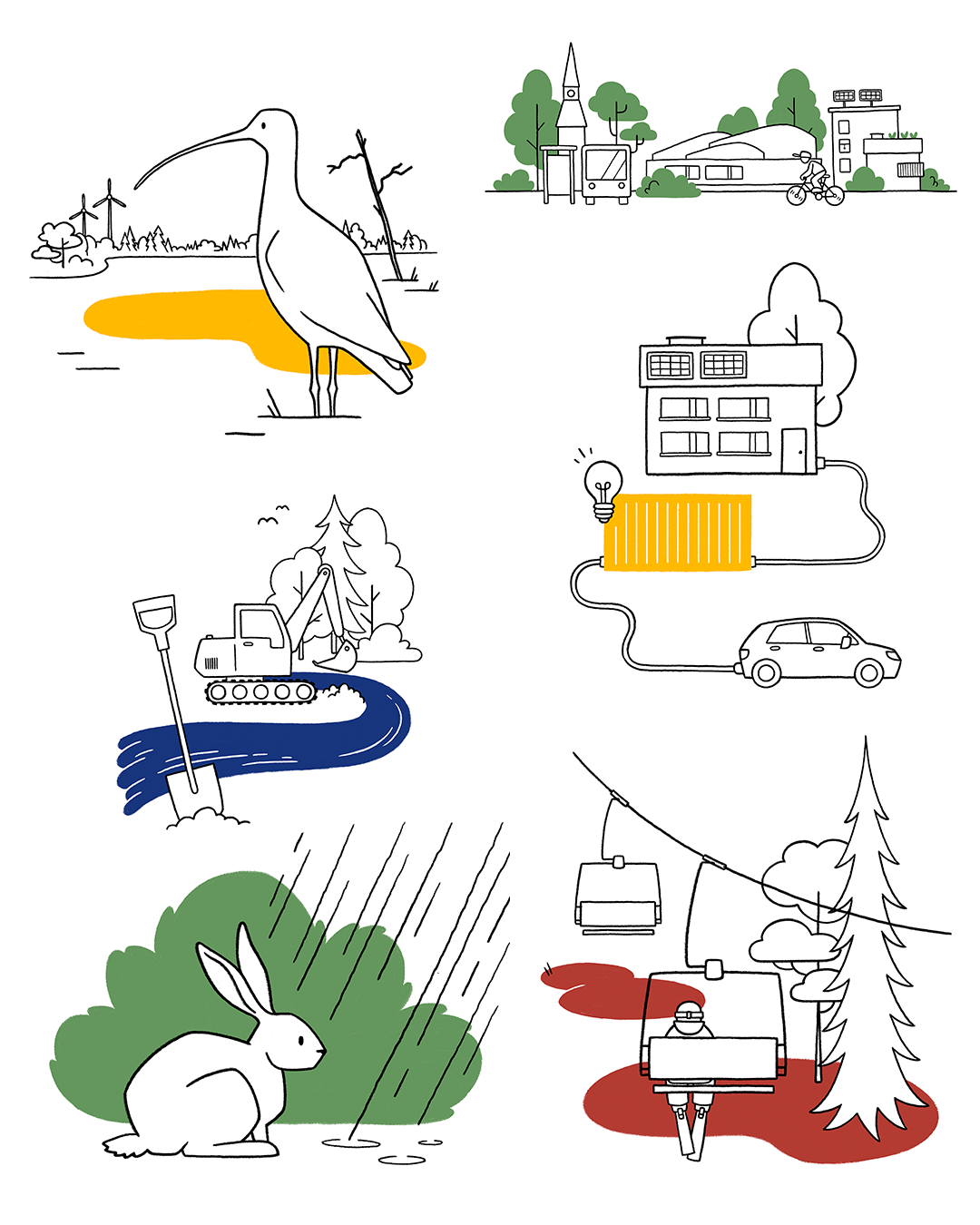
The illustration supports and lightens the narrative. It allows presenting topics such as climate change mitigation and energy flows in a visually comprehensible way. Black-and-white line drawings combined with highlighted brand colors create a cohesive style that brings lightness to the visual identity and guides the reader’s attention.
06 Impact
The customers were very pleased with the work as well as our ability to provide such quality work in record time. On our part, we are always proud of supporting work on a crucial topic close to our heart.
Project Manager: Tarja Väyrynen
Art Director & Graphic Design: Toni Rantanen
Illustrations: Venla Valmu
Want something similar?
Challenge accepted