Rebranding the Arctic Capital
Arctic Capital – Renewing the city brand of Rovaniemi
The brand renewal project for the city of Rovaniemi was built on a strong participation model. Residents, business representatives and other stakeholders were invited to find the brand core together.
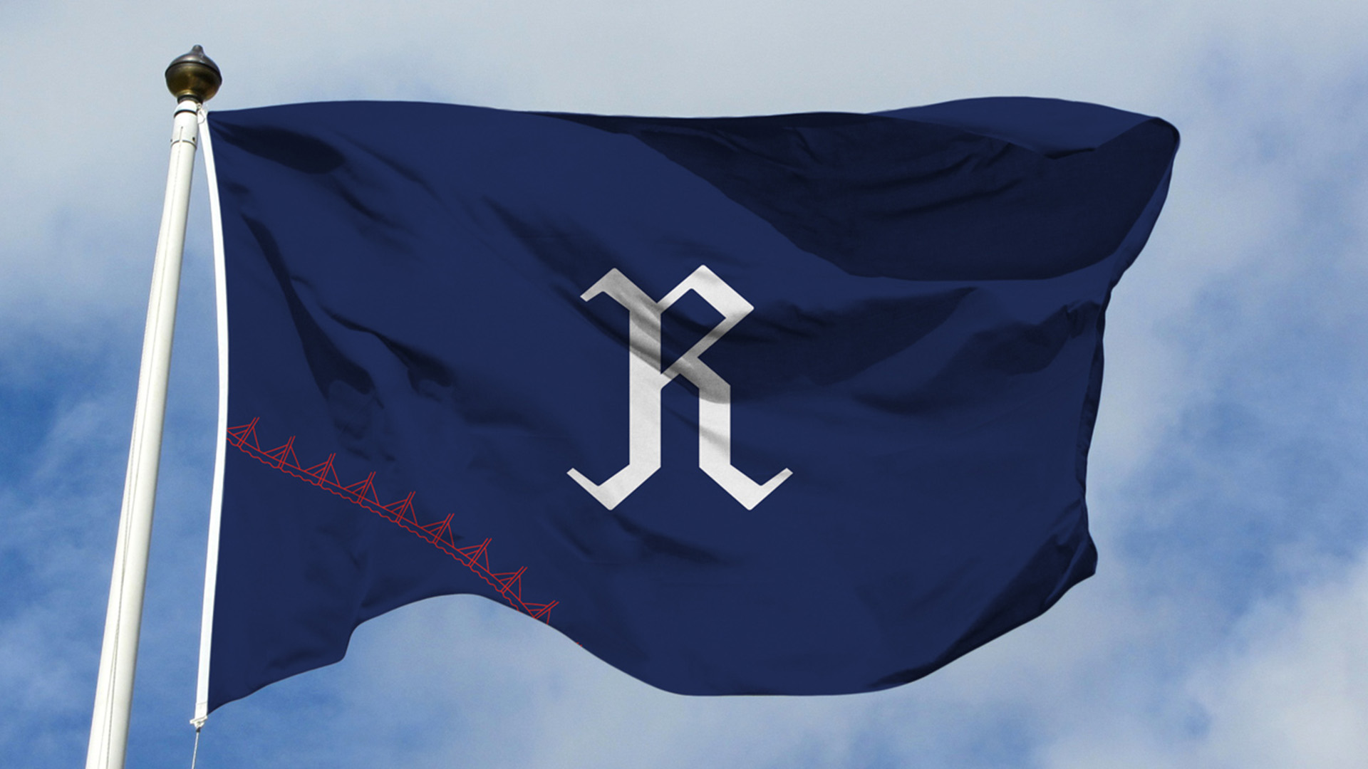
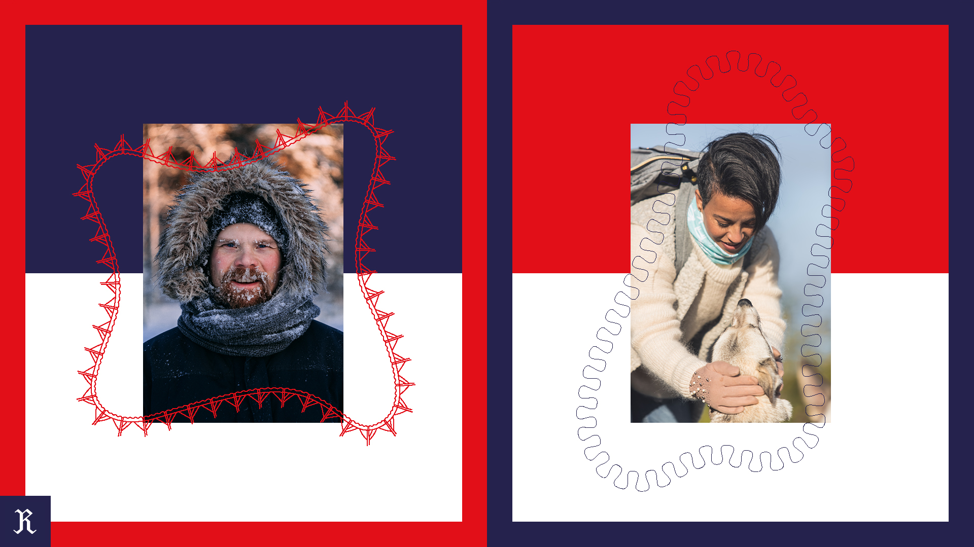
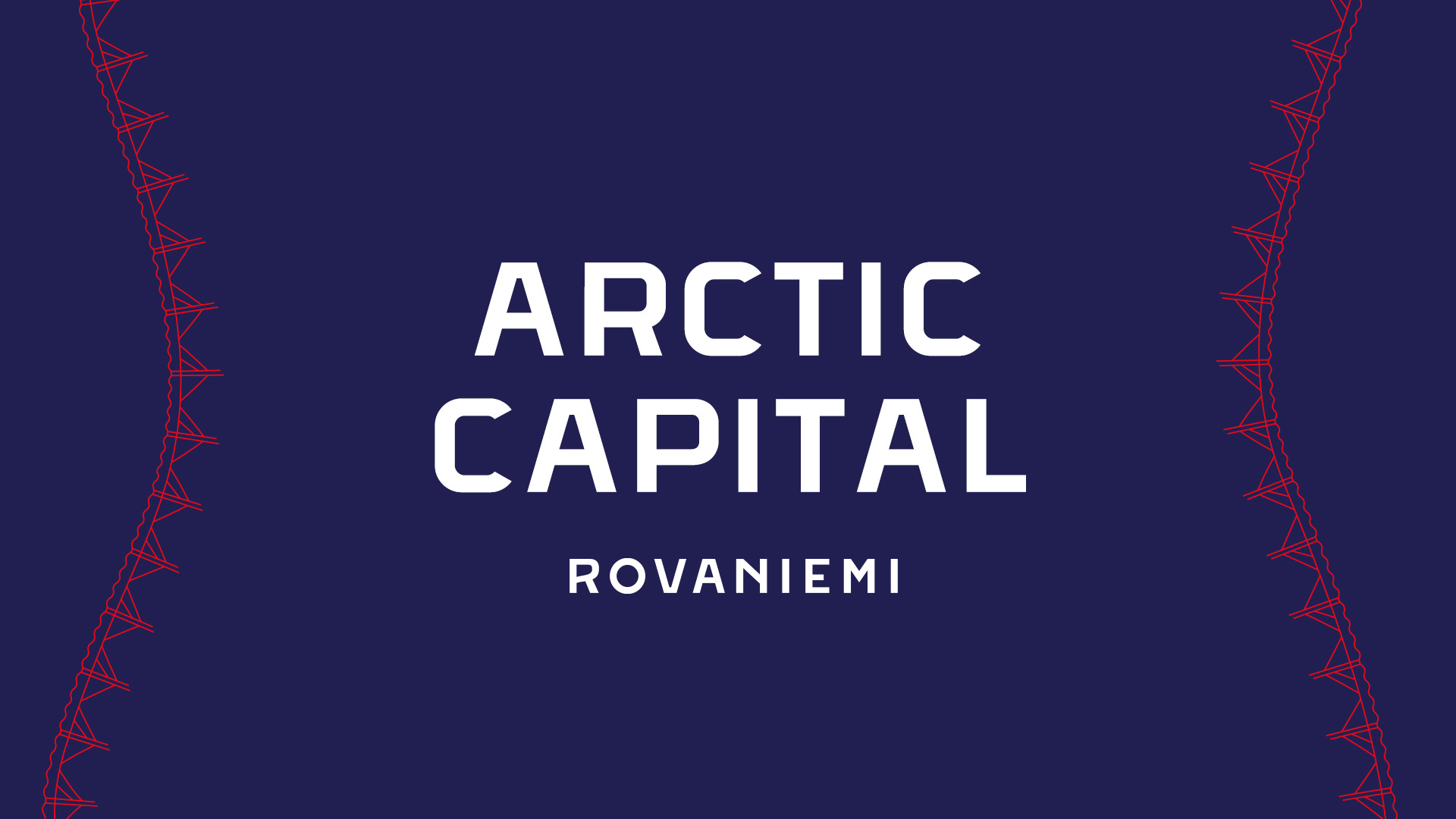
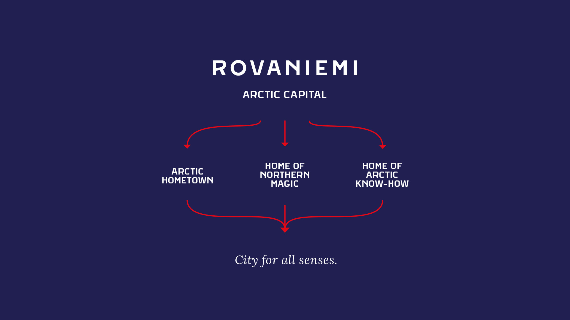
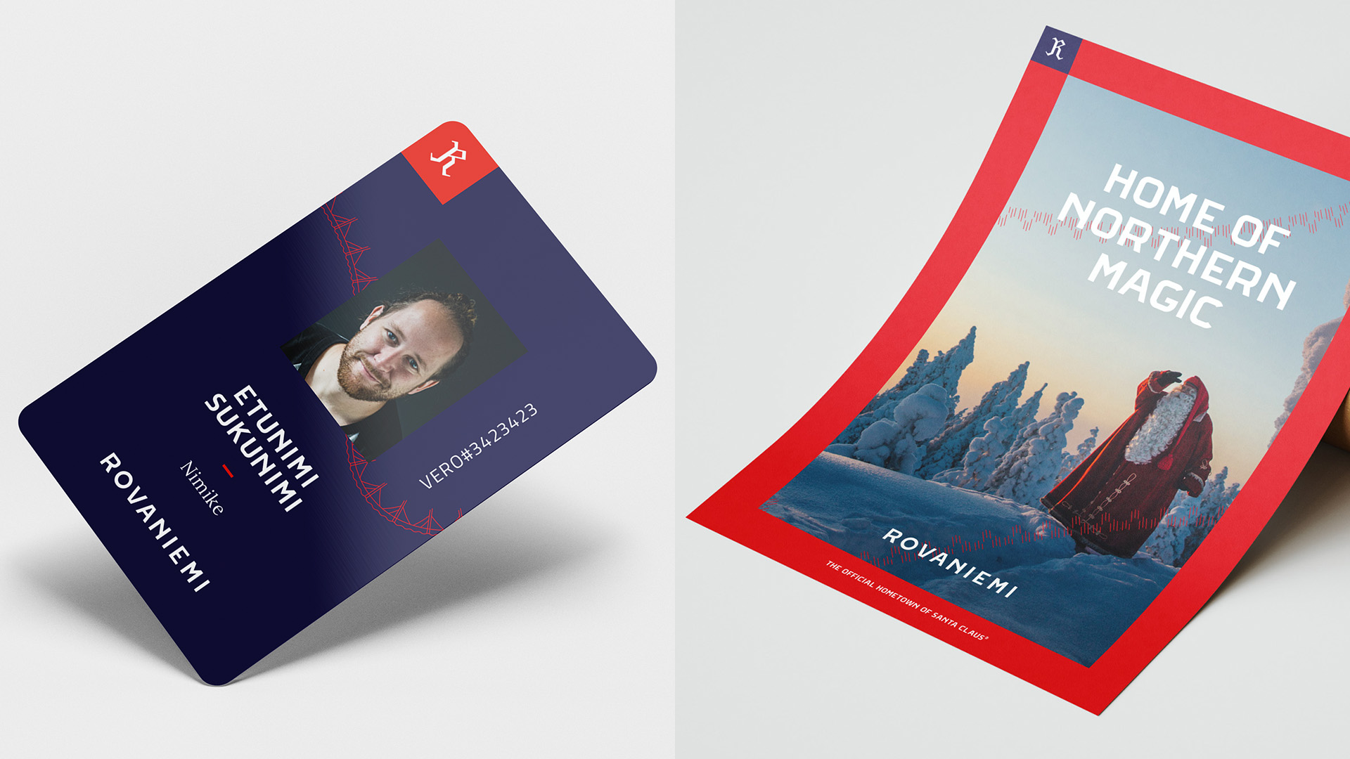
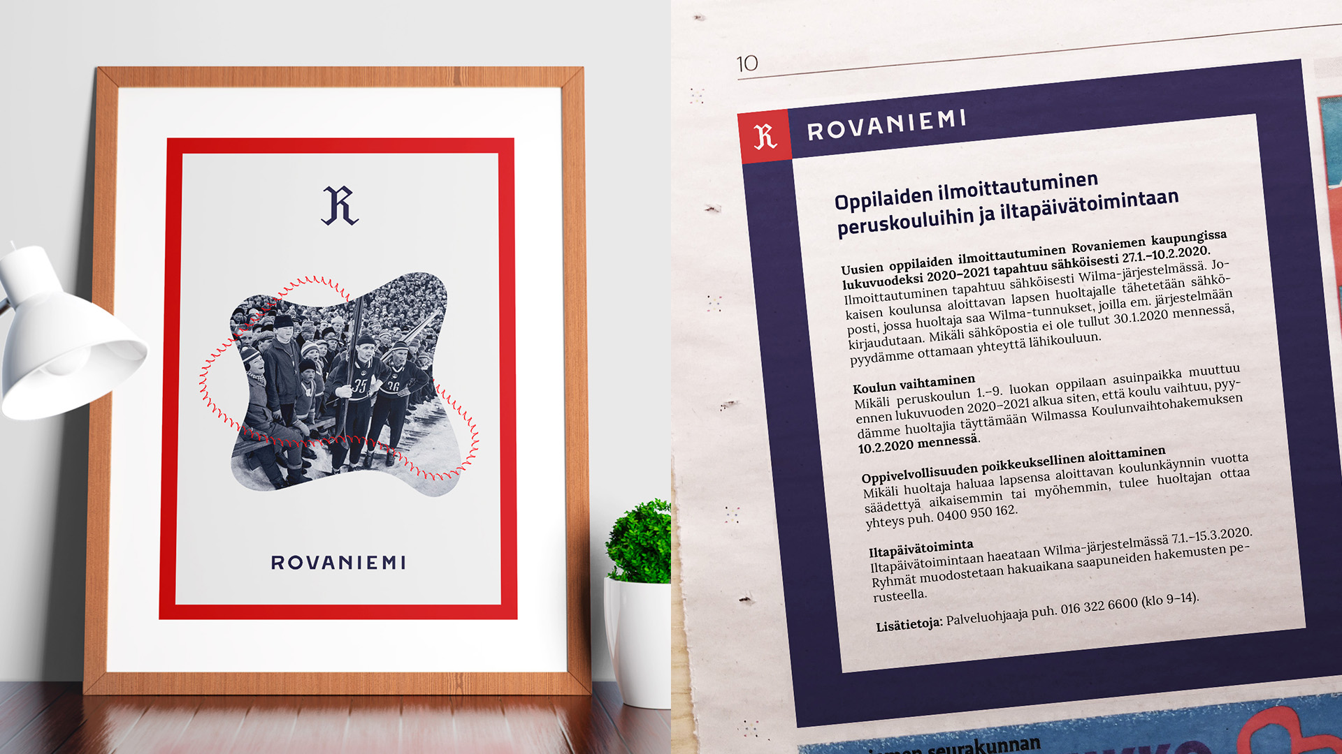
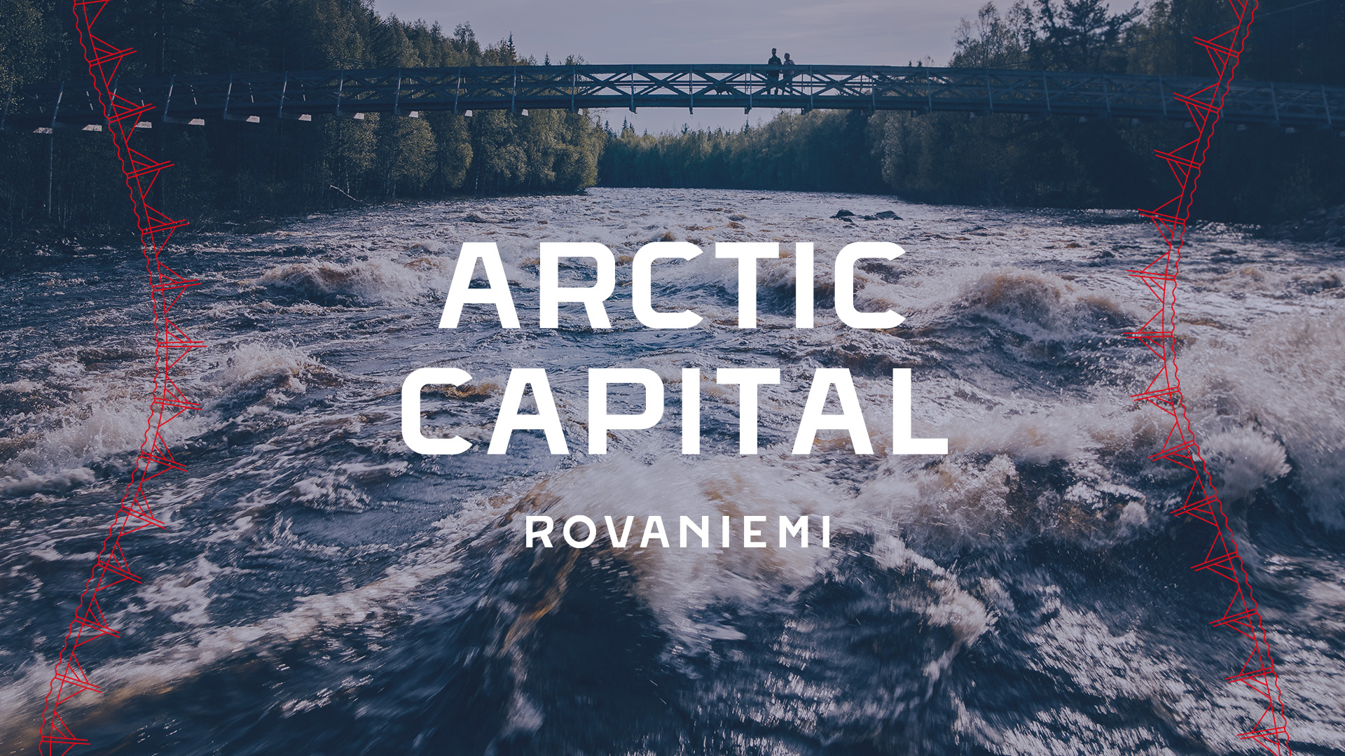
Rovaniemi’s new positioning as the Arctic Capita’ was built on three main topics: Arctic Hometown, Home of Arctic Know-how and Home of Northern Magic. The design system was completely renewed and unified to find efficiency and consistency for the city’s efforts in communications and marketing. The vibrant new look and feel, including logos, symbols, patterns and a color system, will communicate Rovaniemi’s position as the Arctic Capital.
01 Project overview
Rovaniemi’s brand renewal project was done in three phases; participative background work, brand strategy and visual identity, and finally, careful implementation.
- Category/Industry: Public sector & City brand
- Services: Concept design, brand strategy, brand concept, visual identity, campaign design, film & photo production
- Year: 2019->
02 Challenge
Rovaniemi is one of the major cities in the truly Arctic parts of Europe. Besides being the capital of Lapland, Rovaniemi has also established itself, thanks to the incredible efforts of the tourism industry and its stakeholders, as the official Hometown of Santa Claus. For attracting visitors from all over the world, this has been the starting point for marketing and communications. However, for residents, families, students, businesses and general storytelling, there was an urgent need to conduct a brand renewal that would respect the city’s wider strategic goals. What the city truly needed was a unifying brand concept and a totally new visual identity that would stand out and create a sense of community and togetherness, consistently supporting everyday life and events across the city.
03 Creative solution
With the utmost love and care for our hometown, we started the project with a comprehensive background check: research, analysis, and benchmarking before consolidating it all together with the client. The city’s residents, businesses and other major stakeholders were given the opportunity to take part through a digital platform where we conducted surveys and presented the results. This information formed the foundation for crafting the brand messages and general concept for the city brand of Rovaniemi.
Being a prominent force in the North, the term Arctic Capital was already built into the city’s strategy. To keep it simple and genuine, we decided to hold on to it, but tweaked the meaning slightly. Instead of simply being a city in the Arctic and the municipal capital of Lapland, we encouraged Rovaniemi to take on the role as the capital of the entire Arctic region. It has more to do with a certain mindset than a geographical location that many see as a cold, harsh wilderness. With this mindset, the city can transform itself to new heights – and do it with pride.
The three cornerstones that form the Arctic Capital were designed to work on multiple levels. The Arctic Hometown, Home of Arctic Know-how and Home of Northern Magic are the pieces that form the Arctic Capital.
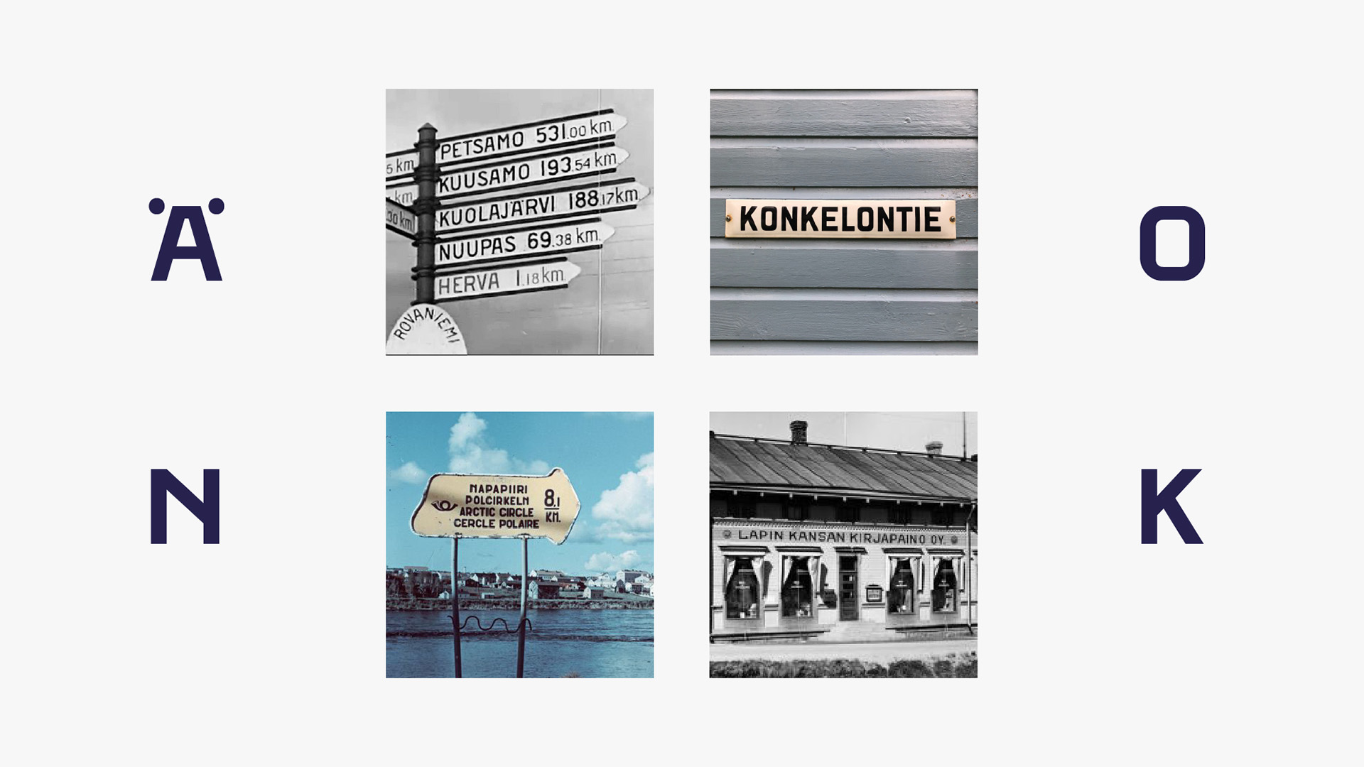
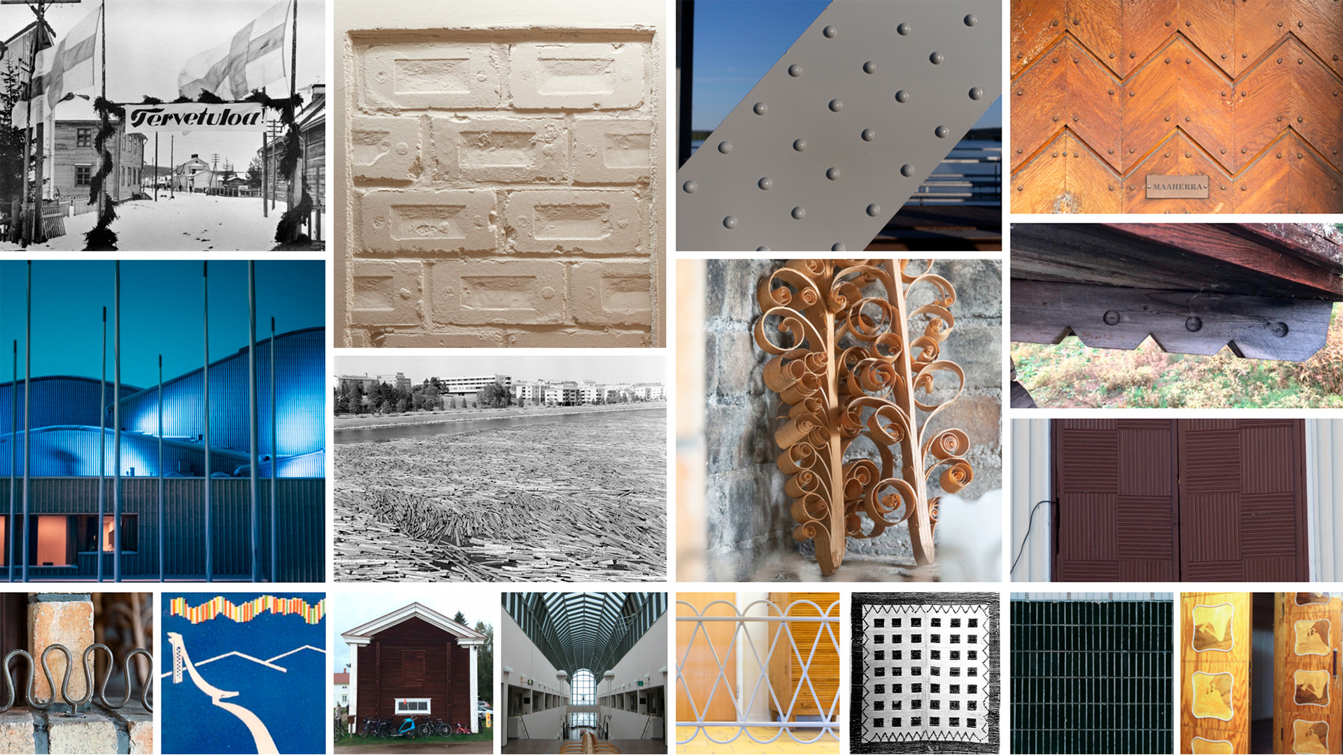
The surveys, discussions and research (as well as our gut feeling) revealed that the Arctic Capital should show more of its history. Additionally, the city’s unique Northern nature and location are something that make the residents proud and happy. These are also the things that people interested in Rovaniemi value the most. Opportunities for a good life, education, starting a business, or investing in the city form a dynamic combination with Rovaniemi’s history and nature – this is all built into the visual identity and overall look and feel of the new branding.
Every brand is formed by the sum of its actions. What we created for Rovaniemi was a brand renewal that aims to inspire action and generate a wider perception of common goals – as well as a sense of somewhere unique to live and visit.
04 Implementation
The total make-over of the city brand required hundreds of decisions, seeing the bigger picture and considering minute details at the same time. As the project’s time span was over 18 months, effective coordination and communication were key to keeping it all together. This is what came out of the pipeline – and what we as residents of Rovaniemi are super proud of.
Brand strategy & concept
- Research and permanent interaction with residents and stakeholders
- Defining the lead thoughts, key messages and areas
- Building the brand hierarchy
- Interpreting and formulating the city’s attitude and tone of voice
Visual identity
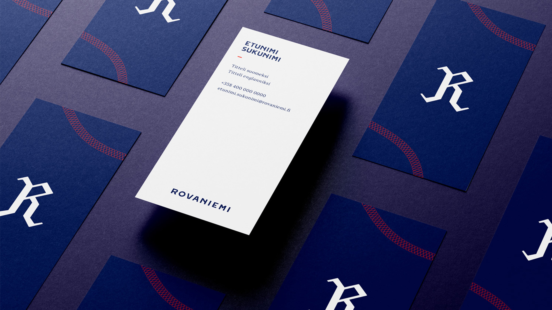
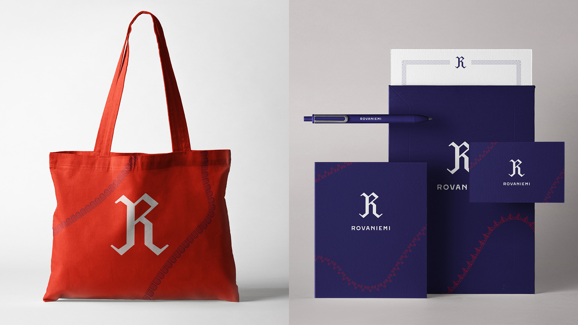
Logo
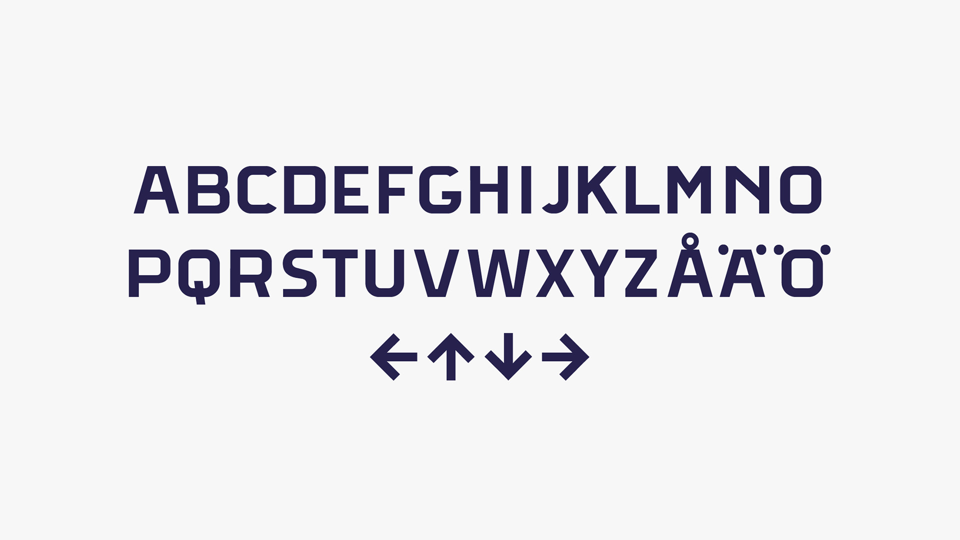
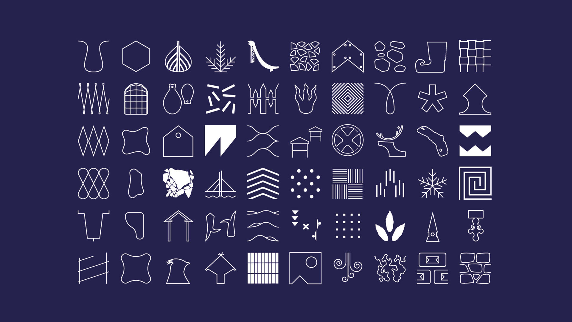
- Illustrations, forms, symbols, icons, and patterns
- Color palette
- Custom typography and supporting typography
- Photography guidelines
- Templates and general guidelines

Campaigns
- Social media posts establishing the new look & feel
- Internal workshopping and with an exclusive keynote speaker to support brand manifestation
- Establishment of a dynamic web platform to source ideas, create action and inform about interesting upcoming events and opportunities
- 100 Actions campaign to underline the importance of being active in doing and enabling things to happen
- A playful interactive generator for creating customized Rovaniemi-pictures
- Crafting outlines for Rovaniemi as Finland’s best city to work remotely
All in all, establishing the new brand and being ready for the future required gearing every part of the campaign towards creating action – big or small – instead of just shouting out the new messages. Why? A brand is built over time, through genuine actions and intent – not by slapping on a new outfit and simply saying that the work is done.
Team
Project Lead / Account Manager: Miikka Niemi
Creative Director: Jussi Laaksonen
Project Manager: Saila Wilhelmsson
Art Director & Lead Designer: Toni Rantanen
Web development: Sohova – Jukka-Pekka Palo Project manager & Joni Ahola Developer
Project Assistant: Ida Tirkkonen
Project Assistant: Lotta Lautala
Editor (video): Henry Kestilä
Editor (VFX): Toni Kauppila
Editor (photography): Adam Eronen-Piper
Client: Riikka Heikkilä, Heini-Tuuli Onnela
Client: Katja Mäntylä, Antti Itkonen, Petteri Nissinen, Johanna Tikkanen
Want something similar?
Challenge accepted